Borders#3
TetheredTogether » Devlog
Devlog #3
================================================
In regards to the game's art, since we decided to use a grid-based system for movement, we felt it was also fitting to use voxel-based models, that way we could stick to a constant scale throughout the project. In order to make these assets we used MagicaVoxel, with a scale of 16 x 16 x 16.
Here is a list of the assets made for the game, along with their purpose and intent:
| NAME | IMAGE | PURPOSE / INTENT |
| Character 1 "Blue" | 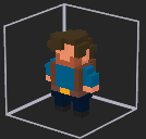 | For the first character we wanted to go with a masculine figure, one with clear identifiable features that would tell the player what he was doing in such a cave. For that we gave him a small back back that would imply to the player that he is some sort of adventurer or explorer. |
| Character 2 "Red" | 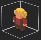 | The second character was designed to have a similar appearance to its mirrored counterpart, however she still needed some defining characteristics that made her visually distinct. For that we went with the golden hair and striped red shirt. |
| Main Tile | 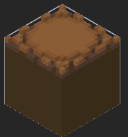 | This object was modeled to serve as the main type of walkable tile. For that it was designed with a circular pattern at its center that would work as the visible platform the player could jump to. Its brown colors were chosen in order to make it feel like the ground of a cave. |
| "Border" Tile | 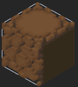 | This is an alternate version of the main tile for the ground. It was designed with visible rocks on one side of the model in order to be used at the edges of the screen. |
| "Door" Tile | 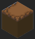 | This is an alternate version of the main tile. It was designed to be placed under the tile where the exit door would be in order to give it a wider platform to stand in. |
| Door | 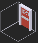 | This object is designed as the objective, having brighter colors than those of the surrounding to catch the player's attention. It is modeled after an emergency exit door. |
| Button | 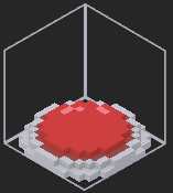 | This object was designed as an objective, using the same colors as the door to allow the player to easily associate one with the other. |
| Button (Pressed) | 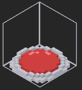 | This is an alternate version of the button that indicates to the player that the button is being pressed. |
| Wall | 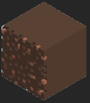 | This asset was designed to be used as a wall texture, defining the limits of the play area. |
| Wall 2 | 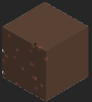 | This asset is an alternative version of the wall with less holes and darker colored minerals. It was made to declutter the design of the walls and add variety. |
| Stalagmite | 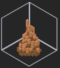 | This asset was made with the intent to serve as a roadblock, occupying tiles and making them unusable, while at the same time adding to the ambiance. |
| "Movers" | 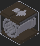 | This asset serves as an alternative type of floor tile, moving the character on top of it towards the direction pointed. Its design is based on conveyor belts as well as in baggage carousels. |
| River | 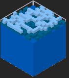 | This tile works as another type of unwalkable tile. For the design, we went with a deep blue to show it was water, with lighter tones along the ripples on its surface. |
| Square Button | 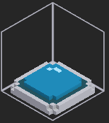 | This object was designed to work like the normal button. However, this button works as a separate set, indicated by its different color and shape. |
| Square Button (Pressed) | 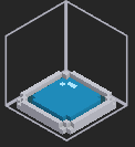 | This is an alternate version of the square button that indicates to the player that the button is being pressed. |
| Triangle Button | 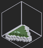 | This object was designed to work like the normal button. However, this button works as a separate set, indicated by its different color and shape. |
| Triangle Button (Pressed) | 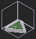 | This is an alternate version of the triangle button that indicates to the player that the button is being pressed. |
| Torch | 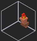 | This torch was designed as a decorative element. |
Get TetheredTogether
TetheredTogether
| Status | Released |
| Authors | Dgeoe Dump, RockyHorrorFreakShow, DMotz´s Proto-Arcade |
| Genre | Puzzle |
| Tags | borders, game-tools, Singleplayer |
More posts
- Devlog#2May 10, 2024
- Borders #1Apr 29, 2024
Leave a comment
Log in with itch.io to leave a comment.